
A mobile-friendly website is a must, and I’m not just saying that because I design responsive websites. If Google’s index split or your own smartphone habits (Are you holding us in your hands?) aren’t enough to persuade you, perhaps the who, what, and how of mobile usage by the numbers will.
Who uses mobile devices?
Almost all Americans. The Pew Research Center reports that 77% of Americans own and use a smartphone, while 95% of Americans own a cellphone of any kind.
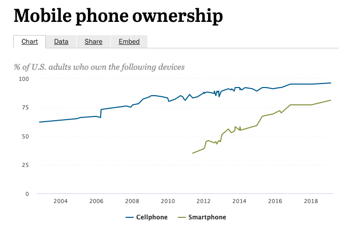
Image via Pew Research
With so many screen sizes and increased mobile functionality, gone are the days of distinct desktop-only or mobile-only users. Desktop-exclusive users, typically aged 65+, make up a very small portion of the overall user market. Most people who use desktop computers also own and use a mobile device of some kind often at the same time (looking at you, music-listeners and podcast-subscribers).
Another advantage of a strong mobile presence? Accessibility. Mobile usage, specifically smartphone ownership, continues to rise. Americans who do not own or cannot afford laptop or desktop devices might have better access to the internet from smartphones or mobile devices. This means that a mobile website or app might be the only interaction a user ever has with a business or service.
Takeaway: While not all Americans use or have access to desktop devices, nearly three-quarters of the population do have access to the internet via smartphones. Mobile websites are a must if you want to compete (or survive) in the current marketplace.
What are mobile devices used for?
Everything from emailing to dating to exercising. By December 2016, the average American was spending 2 hours and 51 minutes per day using a mobile device. Numbers reported by comScore show that 67% of all time spent on digital media can be traced back to mobile devices (this includes smartphones and tablets).
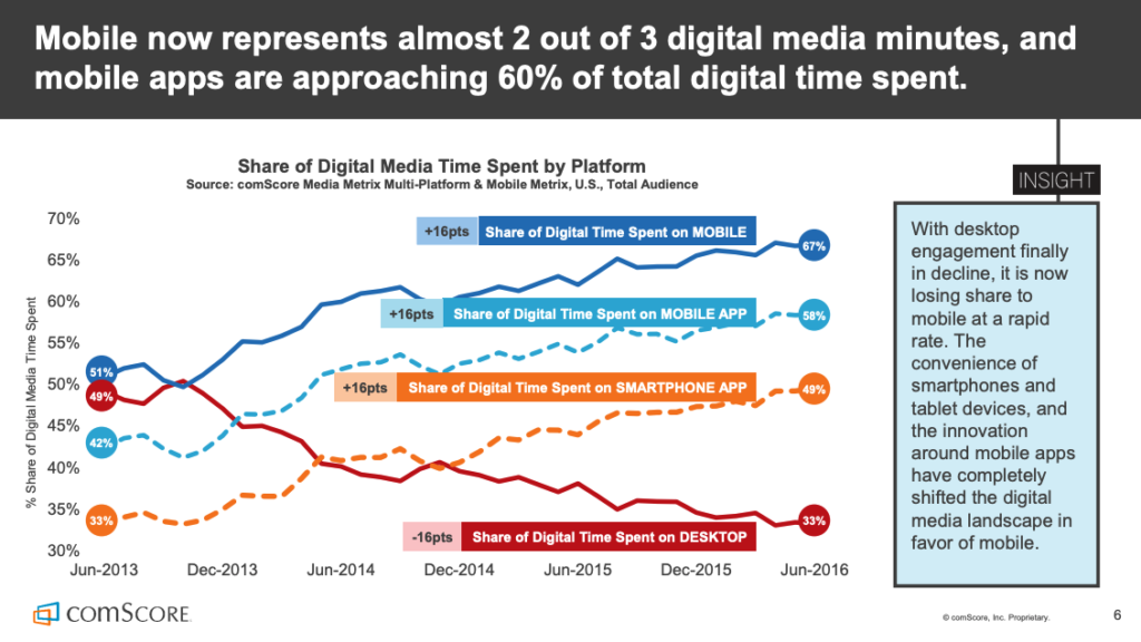
Image via comScore Report
So more often than not, Americans are using their mobile devices over desktop devices. In fact, smartphone app usage accounts for 87% of all time spent on mobile devices. Facebook alone accounts for one out of every five minutes spent on mobile.
So what apps are people using the most? comScore’s data shows the most used apps by unique visitors. The top ten performers starting from the top are Facebook, Facebook Messenger, YouTube, Google Maps, Google Search, Google Play, Gmail, Pandora Radio, Instagram, and Amazon Mobile. The top ten apps are evenly split between social, entertainment, and utilities with Amazon as the only retail app.
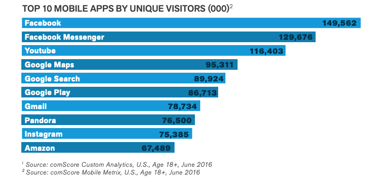
Image via comScore Report
Takeaway: A user’s phone is the closest and quickest way to find information. Mobile web and app usage continues to rise so focus efforts on being found where users are already searching.
How are mobile devices held?
Using a combination of grips. There’s a lot of research coming out that explores how people physically interact with their mobile devices. Users previously fell into a few “grip” categories: one-handed, cradled in one hand while swiping with the other, or two-handed with both thumbs.
Recent research from Steven Hoober reveals that users employ a combination of grips during a given mobile session. For example, a single user could spend 30 minutes using their mobile device and change their grip several times throughout those 30 minutes. They could begin texting with two thumbs, then read an article cradling their device with one hand while they scroll with the opposite index finger, and then scroll and double-tap photos on Instagram with one hand, etc.
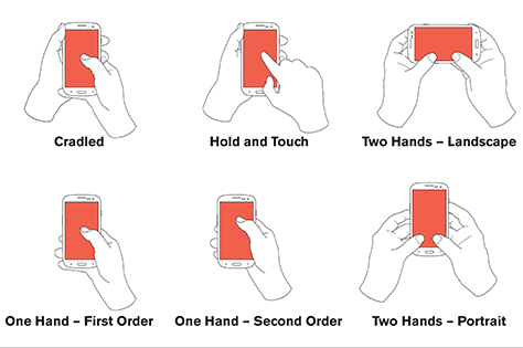
Image via Steven Hoober
Why does it matter how people hold their phones? Grips matter because they affect users’ ability to take action while visiting a website or using an app. For many years, it was believed that the thumb-sweep area was the sweet spot (below).
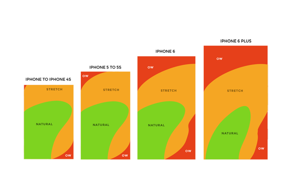
As a result, apps and websites were optimized for action in the lowest quarter of the screen. While not entirely wrong, that viewpoint only validated the thumb motion of right-, single-handed users which did little to address the diverse needs of users at many ages with multiple grips on various screen sizes. The thumb-sweep also missed an obvious insight. Users were more likely to read or click items located smack dab in the middle of their screen. The center is the overlap area from any and all grips.
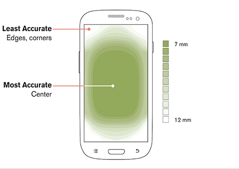
Photo via Steven Hoober
Takeaway: Users hold their mobile devices in a variety of ways, so place calls-to-action or other important information in the middle of the screen for easy and clear access.
There you have it! Almost all Americans are using their mobile devices for anything from communicating to shopping for an average of 3 hours per day. To be found in search and to connect with customers will depend greatly on your mobile presence. Once users find your website, it’s important that your site loads quickly and is easy to navigate no matter who accesses the site.